
Why Technology Matters More — Not Less — as Your Physical Needs Change With Age
There’s a common assumption that technology is primarily for younger people — that as you get older, it becomes less relevant or harder to justify learning. The evidence points in exactly the opposite direction. As vision changes, hearing shifts, and hand dexterity evolves with age, technology becomes more valuable, not less, because it can compensate for changes that would otherwise limit your independence. The key is knowing which tools are worth learning and why they matter specifically for the physical realities of aging.
How Physical Changes Create New Uses for Technology
The physical changes that come with aging aren’t uniform — they happen gradually, affect different people in different ways, and rarely prevent someone from using technology entirely. What they do is change which features become most valuable.
Vision changes are among the most common. By age 65, most people need more light to see clearly, have more difficulty with small text, and may struggle with high contrast environments or glare. Smartphones and tablets address this directly through adjustable text size, screen brightness, high contrast modes, and text-to-speech features that read content aloud. A person who finds reading a newspaper increasingly difficult can use a phone’s accessibility features to have articles read to them, or to enlarge text to a comfortable size — without changing anything about how they use the device for other purposes.
Hearing changes affect roughly one in three adults over 65 and nearly half of those over 75, according to the National Institute on Deafness and Other Communication Disorders. Technology helps in ways that weren’t available a generation ago: smartphones can display real-time captions during phone calls, produce visual alerts (flashing lights, vibrations) so you don’t miss calls or notifications, and stream audio directly to hearing aids via Bluetooth — improving clarity significantly over the ambient sound that hearing aids pick up from the room.
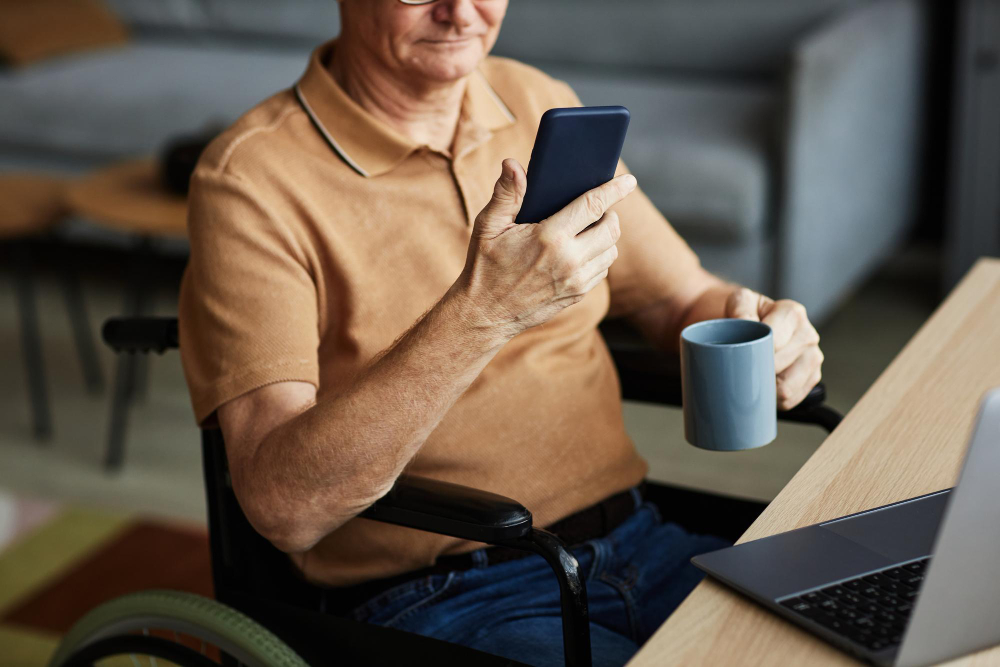
Arthritis and reduced dexterity affect millions of older adults and can make typing on small screens painful and inaccurate. Voice dictation — speaking text instead of typing it — is now reliable enough to be a genuine alternative for most everyday communication. Smart speakers like the Amazon Echo or Google Nest allow voice control of calls, music, reminders, and information without touching a screen at all. These aren’t workarounds; they’re genuinely better interfaces for people whose hands make precision tapping difficult.
What Inclusive Technology Actually Means for Older Adults
Inclusive technology isn’t a separate category of products marketed specifically to seniors. It’s the set of features built into mainstream devices — iPhones, Android phones, tablets, smart speakers — that allow people with varying abilities to use the same tools in ways that work for them.
Apple’s iPhone, for example, has one of the most comprehensive sets of accessibility features available on any consumer device. Every setting described in this guide — larger text, spoken content, AssistiveTouch, LED flash alerts, hearing aid compatibility — ships on every iPhone, regardless of price point. There is no separate “senior version” of the iPhone. The features are there because Apple designed the phone to work for the full range of human abilities, including those that change with age.
The same is true of Android phones, voice assistants, and tablets. The accessibility features aren’t add-ons — they’re core functionality. What changes as physical needs evolve isn’t which device you use, but which features you prioritize and how you configure them.
The Independence Argument: Why This Matters Beyond Convenience
Independence is one of the strongest predictors of quality of life in older age. The ability to manage your own health appointments, communicate with family, handle your finances, and navigate your community without constant reliance on others has profound effects on both wellbeing and self-perception.
Technology, configured appropriately, directly supports this independence in practical ways. Medication reminder apps reduce missed doses without requiring someone else to manage your schedule. GPS navigation on a smartphone allows you to travel independently to new places without getting lost. Video calling keeps you connected to family across any distance. Online grocery ordering and prescription delivery reduce the physical demands of errands that become harder with reduced mobility.
None of these require advanced technical skills. They require a one-time setup — often done with the help of a family member or friend — and then work reliably without ongoing technical knowledge. The upfront learning investment is small relative to the sustained independence it enables.
Starting Points: The Most Valuable Features to Learn First
If you’re deciding where to begin, these four features offer the highest return for the effort of learning them, based on what older adults consistently report making the biggest difference.
Larger text and bold display settings make every part of the phone easier to use — not just one app — and take about two minutes to configure. This is the single most impactful change for anyone who finds reading on a phone screen tiring.
Voice dictation eliminates the need to type on a small keyboard for messages, searches, and notes. It takes a few minutes to learn and dramatically reduces the physical effort of communicating by phone.
Spoken content features — having the phone read emails, messages, and articles aloud — are particularly valuable for anyone whose vision makes sustained reading tiring or difficult.
Visual and vibration alerts for calls and notifications ensure you don’t miss important contact even in noisy environments or when the phone isn’t within hearing range.
Technology doesn’t stop being useful as you age. In many respects, it becomes more useful — because the features designed for accessibility become directly relevant to everyday life in ways they weren’t before. The devices you already own almost certainly have more to offer than you’re currently using from them.

Dan Alex is a technology specialist and digital advocate with over 15 years of experience in system optimization and user experience (UX). Throughout his career, Dan has witnessed the frustration that rapid technological shifts cause for the senior community. As the founder of Apps for Download, Dan Alex combines his technical background with a passion for simplified education. His “human-first” approach to technology has made him a trusted voice for families and caregivers looking to empower their loved ones with digital tools.