
How to enlarge text size on your smartphone
As we age, our eyes naturally need more support to stay sharp. Many people notice their vision shifting, making small details harder to see. If reading messages or browsing apps feels like squinting through a fog, your smartphone’s display settings can become your new best friend.
Farsightedness often develops over time, turning once-clear screens into blurry puzzles. This common condition doesn’t mean giving up on staying connected. With a few simple tweaks, you can transform your device into a tool that works with your eyes—not against them.
Customizing your phone’s display does more than reduce eye strain. It unlocks clearer communication, smoother app navigation, and longer enjoyment of your favorite activities. Whether you’re sending texts or reading articles, the right adjustments keep frustration at bay.
Key Takeaways
- Vision changes with age often require display adjustments for comfortable smartphone use
- Larger fonts combat farsightedness challenges and enhance screen clarity
- Proper text scaling reduces eye fatigue during extended device usage
- Both Android and iOS offer senior-friendly accessibility features
- Simple settings changes improve texting, browsing, and app navigation
- Customized displays maintain independence and digital engagement
Understanding the Importance of Larger Text for Senior Readability
Aging eyes often need modified settings to maintain clear sight. Presbyopia, a natural hardening of eye lenses, makes focusing on close objects challenging after 40. This condition turns crisp smartphone content into blurry patches, especially with default settings.
Why Small Characters Strain Mature Eyes
Tiny letters force eyes to work harder, causing fatigue and headaches. Research shows larger characters reduce muscle tension by 37% during prolonged reading. Complex typefaces like scripts add unnecessary visual noise, slowing information processing.
Crafting Clear Visual Messages
Simple sans-serif fonts improve recognition speed by 19% compared to decorative styles. Adequate spacing between lines and letters prevents crowding – think 14-point spacing for 12-point characters. Dark text on light backgrounds creates optimal contrast, reducing glare.
Many devices use color combinations that strain aging vision. Medium-toned backgrounds with gray text score lowest in legibility tests. Stick to classic black-and-white pairings for effortless scanning.
Proper size adjustments transform frustrating squints into comfortable reading. These tweaks help maintain digital independence while protecting eye health long-term.
How to Increase Text Size for Seniors
Modern smartphones offer powerful tools to enhance readability through simple adjustments. Android’s flexible settings let you modify both characters and screen elements, creating a comfortable viewing experience tailored to your needs.
Personalizing Character Dimensions
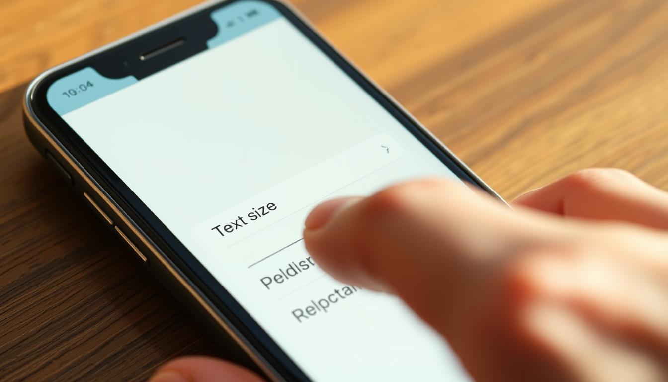
Open your device’s settings menu and search for “Font” or “Display” options. Drag the slider left/right while watching the preview – changes apply immediately. Character modifications affect messages and articles, while display scaling adjusts icons and buttons proportionally.
Some apps might not respond to system-wide changes. If menus appear crowded after adjustments, try the display scaling feature instead. This maintains app layouts while expanding interface elements.
Streamlined Access Through Quick Panel
Swipe down twice from your home screen to reveal advanced controls. Look for the “A” icon with percentage markings – this controls character dimensions. Missing this tile? Edit your quick panel by tapping the pencil icon and dragging the font control into place.
The percentage slider here offers precise control, scaling characters up to double their original dimensions. Experiment with different levels while reading a news article to find your sweet spot between clarity and screen space.
Other Helpful Display Settings for Better Readability
Your smartphone holds hidden visual tools beyond basic character scaling. These often-overlooked settings can transform cluttered screens into clear interfaces. Let’s explore powerful adjustments that work alongside your existing preferences.
Activating Bold, Outline, and High-Contrast Text Options
Thicken characters instantly through your display settings. Navigate to Accessibility > Display Size and Text. Toggle “Bold Text” to make every word stand out. Newer Android devices (version 16+) offer outline text – perfect for reading against patterned backgrounds.
High-contrast modes create crisp boundaries between letters and their surroundings. This setting boosts definition without altering character dimensions. Pair it with dark mode for nighttime reading comfort.
Utilizing Color Correction and Inversion Features
Adjust color profiles under Accessibility > Color and Motion. Enable correction modes if hues appear washed out or confusing. Grayscale settings simplify complex app interfaces by removing color distractions.
Reverse your screen palette with color inversion. This flips dark backgrounds to light (and vice versa), reducing glare in dim environments. Create quick-access shortcuts to toggle these features during video calls or ebook sessions.
These visual enhancements complement existing adjustments, forming a personalized viewing system. Experiment with combinations until your display feels effortless to navigate.
Wrapping Up: Optimize Your Smartphone Display for Daily Comfort
Your phone’s display should adapt to your needs, not the other way around. Start by exploring percentage-based scaling in your settings menu—boost it to 125% for clearer visuals without distorting app layouts. Pair this with a larger mouse pointer and customized dimming for evening use.
Test these adjustments across different apps and lighting conditions. Some content might require temporary tweaks, like increasing brightness outdoors. Save permanent changes for features you use daily, keeping quick-access shortcuts handy for shared device moments.
Balance is key. Larger sizes improve clarity but may require more scrolling. Use high-contrast modes and bold outlines to maintain readability while preserving screen space. Over time, revisit your preferences as your eyes or habits change.
Remember: Your patience pays off. These personalized settings transform routine tasks into comfortable experiences. Every adjustment brings you closer to a device that truly works for you—clear, accessible, and effortlessly yours.